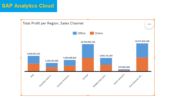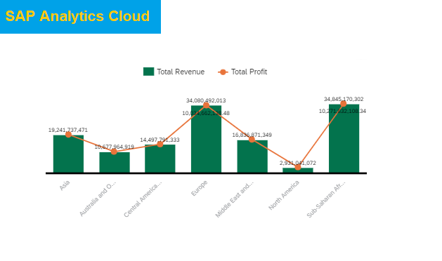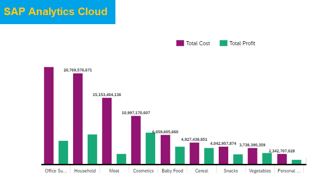
Line Chart in SAP Analytics Cloud
Introduction: Line Chart in SAP Analytics Cloud is the chart which can be used to present the trend of data in line form, and showing trend data in line chart is the best way to analyze the trend analysis. Trend can be analyze of date and any dimension. In this example we will see line […]