Charts

List of all available different types of charts in SAC. Few example, Line chart, Bar chart, Bullet chart, Waterfall chart, Combined chart, Time series Chart, Heat map Chart and many more.


Different Types of Charts in SAC

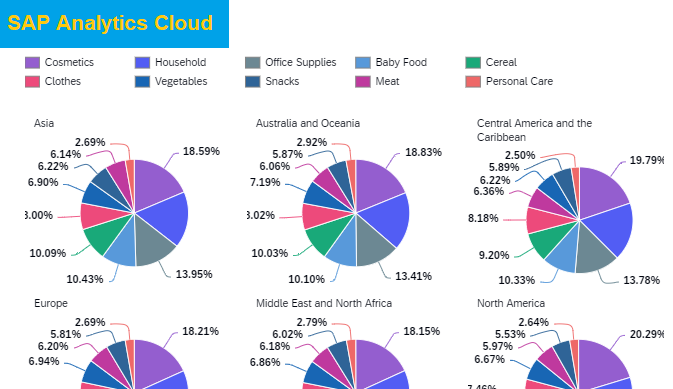
SAP Analytics Cloud is a BI tool. It has many charts and graphs to use to build good and interactive visualizations. A chart refers to a graphical representation of data that helps users visualize their insights and make easy data driven decisions. Different types of charts in SAC allow users to quickly analyze and interpret […]

Bullet Chart in SAC

Introduction:  A bullet chart is a other form of a horizontal bar chart and its look like progress bar. The bullet chart in SAC compares one measure with another measures for example actual vs Target, Actual vs Forecast and displays the bar with a threshold or set of ranges. In single bar you can show

Scatterplot Chart in SAC

Introduction: The scatterplot chart in SAC allows the user to determining the trends of any dimension for large scope of data. For example, if you input product information, including cost, unit cost, profit etc, you need to show of plotted points that represents the pool of product information. With scatterplot chart you can easily identify

Heat Map Chart In SAC

Introduction: A Heat Map chart in SAC is a data visualization technique which is used to shows heat or weight-age of quantity or amount in the form of colors on two dimensions. The color variation on the heat map will show in boxes, which tell users that which area is more effective either good or

Stacked Area chart in SAC

Introduction: Stacked area chart in SAC is used to show the trends in line form with fills areas between the lines. It is helpful if you want to see how much area is covered with the product, region, or items. If the quantity and amount is high then the area between the line shows bigger

donut-chart-SAC

Donut Chart in SAP Analytics Cloud

Donut chart is a variant of the pie chart, with a empty circle at the center allowing for additional information about the data as a whole to be included. Donut charts are similar to pie charts in that their aim is to show proportions values in the each section of donuts chart.  This article describe

Waterfall-SAC

SAP Analytics Cloud Waterfall Chart

In SAP analytics cloud waterfall chart shows how the value is increased and decreased between two set of period and leading to a final cumulative value shown in the far right column. The middle values can either be time-based or category based. Waterfall chart used for what? Waterfall Charts are used to visually how a starting value of

Time Series Chart in SAP Analytics Cloud

Trend analysis is one of the best way to analyze your data as compare with month on month, Quarter on Quarter and year on year. SAP analytics cloud have new kind of chart called Time series chart. Which plot the data in time frame in line chart by default. You will see below options on

in cell chart SAC

Insert In cell chart in SAP analytics cloud

Introduction When you display the data in Table then the numbers are bit difference from each cells, if you want to show the highest data on top you can sort the one column, However, this will be difficult if there are more then one column because you can only sort by one column and others

pie chart SAC

Multiple Pie Chart in SAP Analytics Cloud

Introduction: Pie chart  is a circular statistical graphic presentation of numbers, which is divided into slices to demonstrate numerical proportion. In a pie chart, the length of each slice is proportional to the quantity it represents. in this article we will show you how you can create multiple Pie Chart in SAP Analytics Cloud. Pie

Scroll to Top